The ‘Okina and The Sinister Logotype Deadline

I've always had a love/hate relationship with logo design. The hate part is usually because logo assignments typically land on my desk at the last possible minute and there's never enough time to go deep. This was the case when longtime clients Mark & Marjorie Fuller called me late one night and said they were changing the entire concept of their fine dining restaurant Spring Hill into something a little more casual and a lot more Hawaiian. What they needed was a new logo, menus, and a website overnight (well, over the course of a week, but you get the idea).

The plan was to convert the existing Spring Hill logo (which was designed by somebody before me) into Ma‘ono Fried Chicken & Whisky and my job was to come up with new typography and color to better represent the new direction with an obvious nod to Hawaii. The Hawaiian word ma‘ono roughly translates to "make delicious" and after playing around with Hawaiian color palettes and different letterforms, the end result looked something like this:

From there we moved on to websites and business cards and menus and all the rest. The clock was ticking, but we were making it work. Then, about a day or two before reopening, I got another call from Mark. "We screwed up the ‘okina." What the hell's an ‘okina?! Turns out, the apostrophe between many Hawaiian words to mark the phonemic glottal stop (MA-Ono) actually has a name (‘okina) and it's represented by the left single quotation mark—not the right. This is what happens when you don't have time for research! So we had to quickly change the logotype at the last minute to this:

I didn't really like the look of this new eleventh hour version, it just didn't feel right to me, but it was too late. We had to start printing menus and making signs. Not gonna lie, this whole thing made me a little sad. But, these things happen under duress, and we move on.

Fast forward a year or two later and Mark called me up again to work on some alternate logos for Ma‘ono that would be used for various pop-ups and concepts he was doing around Seattle. One was at the Rhino Room, another was a loose idea for a tiki cocktail lounge called Ma‘ono Sand Bar. So I went all the way back to the sketchpad and took another look at that damn ‘okina. And before too long I had a revelation: What if I worked the ‘okina into the negative space between the letters somehow? And, by golly it worked! After all that time, the final result is now one of my favorite logos ever. All it took was a couple of years to get there.

The Fullers were convinced as well, and all the old collateral was scrapped over time in favor of this new improved version. The logotype itself has even morphed into a new version that I’ve seen at the various fried chicken outposts in collaboration with Rachel’s Ginger Beer.

I'm not sure what the moral of this story is, but perhaps it’s: when that thing doesn't feel quite right, it’s probably not. Maybe don't wait two years to fix it next time.

Anyway, go eat at Ma‘ono Fried Chicken & Whisky if you haven't already. Mark is one of the best chefs the Pacific Northwest has ever known. The fried chicken is revelatory—and don't skip the Spam Musubi!

The Making of a New Restaurant Brand (and a Design Career)

I've known Eric Banh for a very long time.

After spending a few years teaching English at a University in central Thailand, I returned to Seattle well-tanned, penniless and in desperate need of a job. This was late in 1998. After a brief stint working for Wolfgang Puck(!), I ended up waiting tables for a Vietnamese restaurant that had just opened the previous month. It was called Monsoon. I ended up working there for almost four years as I tried to get my design career back on track, waiting tables a few nights week while teaching myself web design between shifts. I had been working in the industry since I was old enough to drink, but as it turned out, Monsoon would be my last restaurant job—well, relatively speaking.

Original Monsoon website, circa 1999.

But, before I was lured away to work in a big, fancy graphic design agency, I had the pleasure of really getting to know Vietnamese cuisine (and wine) working for Eric and his sister Sophie. And, I got to moonlight as a web designer all the while. Monsoon's website was the first restaurant website I ever designed—and probably one of the first chef-owned restaurant websites in Seattle. I did the entire project in trade for two bottles of Zind Humbrecht Gewürztraminer.

After I finally left Monsoon to get that "real job" in an agency, I continued to build websites and do graphic design work for Eric. I probably designed and built around five different versions of Monsoon's web site over the years (and yet another in the works currently). Several years later I finally decided to quit the agency world to run my own design business. Right around that time Eric told me he was finally going to start building the noodle house we had been talking about for years. I was excited. A new place! A new name! A new logo! It was all going to be created from scratch. Perfect timing.

Eric decided to name his new place Ba Bar. Ba means "father" in Vietnamese and Eric's dad had just passed away. This restaurant was going to be dedicated to the elder Banh himself. Eric told me stories of being a kid in Saigon, eating street food with Sophie and their father, sitting on tiny stools and slurping noodles in the crowded marketplace. He wanted to bring that very feeling to this new restaurant. He wanted to keep it casual and keep it fun. This wasn't going to be a down-market version of Monsoon, it was going to be something completely different. Simple food inspired by the streets of Saigon—with cocktails. My kind of place.

So I spent some time with Eric's ideas and I came back a week later with some logo roughs and a tagline concept: Street Food & Cold Drink. Eric and I have understood each other pretty well over the years, and I could see his eyes light up. Street Food & Cold Drink! That was exactly what he was after. The concept was born.

The rest of the Banh family needed some convincing, however. Nobody quite understood the missing "s" on Drink and they were worried that Americans would think we spelled it wrong. It took some work, but I convinced them in the end (I think). It helped that Eric understood it from the beginning. The other hurdle was the idea of Street Food itself. People in the west tend to think Street Food means food served out of a truck. While in Southeast Asia, street food is food served roadside or in busy markets by some of the best cooks you can find. It's more like fast food—but really good fast food. (Side note: One of the first critics to review the restaurant made this very observation—that Ba Bar wasn't really street food because the food wasn't "portable". Which goes to show what little food critics actually know about South East Asian cuisine.)

For the logo itself I brought in illustrator and good pal David Cole to help come up with some drawings of the mark. I really liked the idea of using a simple, graphic illustration of Eric's father's face, but not everyone could agree on the appropriateness of using the elder Banh's likeness as a logo. Next, we tried a guy bent over a bowl of noodles sitting on a tiny stool. (If you have ever spent time in South East Asia you will understand this visual.) That got a bit more traction, but in the end, we decided to keep the mark simple and opted for a straight typographic solution. The biggest challenge was to make sure the logo read as Ba Bar not Babar, as we didn't want to be confused with a certain French Elephant. So stacking the type seemed crucial. There's only three different letters in the name, so that was challenging, but I think it worked out really well in the end. It's not too repetitive visually and it reads Ba Bar as much as it can. I still ended up using the illustrations that Dave created in some of the collateral, but the main logo became the name and tagline in a circle.

BaBar06.jpg

From there we rolled out laser-etched menus boards, rubber-stamped napkins, a giant neon sign, window graphics, jam jar labels, a website and much more. I'm especially happy with how the website turned out. We really wanted to make it fun and semi-educational by highlighting certain dishes and and explaining them in detail. We are planning to expand this kind of content moving forward.

If you live in the Seattle area you should stop by Ba Bar for a bowl of soup or a cocktail—and a grab a macaroon on the way out. It truly is a fun place, the vision paid off. And Ba Bar makes the best phở in town without question. You might even find me at the bar hanging out with Eric, talking about the good old days when he could still boss me around.

Rebranding Cactus Restaurants

Marc Chatalas contacted me a few years back because he had seen some of my web design work around Seattle and wanted to meet me. We had a drink over at Alki Beach and we talked websites and design. As it turned out, he didn’t really have any pressing design needs at the time, he just wanted to see what I could offer for future reference. At the time, I was still working at an agency while doing freelance design for restaurants on the side.

mimbres.jpg

The Collaboration

Fast forward to the future (early 2011) and Marc contacted me again to discuss a new website and ultimately a brand refresh to coincide with the opening of a new Cactus location in South Lake Union. This sounded like a perfect fit for the business I had just started a year earlier. My goal has always been: to offer soup-to-nuts design for restaurants (I just trademarked that BTW). But sadly, I was buried in work. Too much work in fact, so I told him no. I recommended some other, bigger firms in town, but in doing so also told him that he would likely pay more and get less with a bigger firm. My way of keeping one toe in the door I guess.

A week later he emailed back and asked me to work on his project again. Due to my sinister workload, I should have said no a second time, but the project sounded really challenging and fun, so I started looking for a partner to help out on the print side. My plan was to get someone to collaborate with me directly on the brand refresh, then set him or her loose on the print collateral while I worked on the new website and gathered photography. Nikki Cole Creative agreed to join the effort, and we pitched the idea to Marc and his brother/business partner Bret. In early summer of 2011 we started work on the new Cactus Brand.

The Old Brand

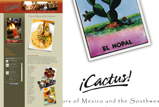
The old Cactus website and logo.

The old Cactus website and logo.

Cactus Restaurants has been around since 1990. They started out small, cooking tapas at their first location in Madison Park. The logo itself had been updated a few times, but the overall look and feel of the brand was made up of a lot of different parts over the years and it was becoming unfocused and disjointed. Another problem was how they displayed the name ¡Cactus! by using the traditional Spanish punctuation. With the advent of all things iPod and iPad people began to mistake the name for something related to the tech industry: i-Cactus. This was eroding trust in a brand that really wanted to stay humble for the most part. It reeked of bad marketing decisions by no fault of their own (blame Steve Jobs).

Something else I noticed in talking with them is the notion of Southwest cuisine itself. What was once a hugely popular cuisine in the 80s had been slowly pushed to the back burner in favor of more traditional Mexican or Taco Truck style restaurants. But Southwestern food is actually great, so why do people downplay it? I wanted to explore this. I used to work in the agency world and often brand strategists would say things like: “Company X needs to own the color red.” I always found that to be kind of a ridiculous statement. How do you “own” a color? What the brand people really mean is: “Pick a color and use it a lot”. But, in thinking about this more, I really started saying to myself that Cactus should indeed “own” Southwestern cuisine. It really is a good differentiator for them in a market that is full of so many Mexican restaurants. Cactus does great Mexican, but the Southwestern stuff is really where they can make a statement.

The Brief

The creative brief for the logo was pretty simple. We wanted something a bit more modern and also a bit more sophisticated. This was driven by the new South Lake Union location which was going to be different stylistically from the previous Cactus restaurants. But, we also wanted it to work well at the older locations too, so it couldn’t be too slick. It needed some texture. And really, what we heard the most from Marc and Bret about Cactus is that they want the restaurants themselves to make you feel like you are on a vacation. When you dine at Cactus you should feel like you are taking a much needed break, enjoying a cocktail on the beach, relaxing. The brand needed to communicate that somehow.

The New Logo Direction

We explored a lot of different directions over the course of a month or so. We had cowboys, saguaro cactus arms, cactus flowers, Navajo cave paintings, type solutions pulled from old Mexican signage, and a whole lot more. We presented six solid options with a lot of variation. After the first meeting we had narrowed it to 5. (Not what we had in mind!) But, we liked them all too, so we went about refining the various options and incorporating feedback from the guys at Cactus.

Early design roughs.

Mimbres

In the end we all decided to go with an option we were calling Mimbres. The idea for the mark was based around a style of Native American pottery found in what is now southern New Mexico. It offered us an opportunity to actually create four distinct marks, one for each of the Cactus locations. (This increased our workload fourfold, but we felt it was worth it.) Nikki did the illustrations herself, borrowing a bit from the Mimbres art, but in the end she really made them her own and incorporated abstract representations of cactus plants and flowers in each one. What’s great about the logo marks is that they are born from a marriage of Soutwestern folk art and cactus plants—but without being obviously cactus plants. The Saguaro cactus arm was really something we wanted to avoid (think Taco Time). So for instance, we used a top-down view of a barrel cactus for South Lake Union but the shape also works without that meaning as a stand-alone motif. Even better still, it could also be a lime wedge on the rim of a cold margarita. We ended up with a lot of room for interpretation which really made the whole identity system shine.

Website

While Nikki began producing new menus and collateral, I switched gears and began creating the new Cactus website. We wanted something bright and sexy, but function was equally important. With four different locations this can get tricky, so there had to be clear paths to the stuff people wanted most: hours, directions and menus. All the while keeping the user oriented to the individual locations themselves. The rest was easy. We had so much material to work with following the branding phase of the project, that the look and feel fell into place rather quickly. A good argument for finding a print designer who is also your web designer!

The Next Phase

This project was really fun. And fun because Marc and Bret Chatalas are great people to work with. They provided great feedback and brought a lot of good thinking to the process. And, they knew exactly when to be involved and also when to jump out of the way and let us work. I’m looking forward to a long working relationship with the brothers at Cactus. (We even designed a fifth logo mark just in case they get curious about new real estate.)

In the end, I’m glad Marc decided not to take my advice and find a bigger firm to work with. I haven’t had a day off since last summer, but it was well worth the effort.


Spring 2011: New Websites and A Whole Lot More

Well, time does fly. Since my last post I've launched a few sites, shot a bunch of new photos and even managed to sneak a logo or two in there. Here's the run-down:

Lagana Foods

Not only do people often think that Ethan Stowell and I are the same person, they probably think we spend a lot of time together with all the work I do for his company. While we do hang out from time to time, for this project I actually worked more closely with his partner, Kaela Farrington, on a new website for their specialty pasta company: Lagana Foods. During the discovery process we spent several hours drinking Negronis and snacking on smoked mackerel before we decided we didn't really want to do the usual website design. That led us to the top-down pasta pile photo shoot which quickly became the obvious choice for a homepage. The rest flowed from there. I really like how this turned out.

Check out Lagana Foods and if you are in the Seattle area buy a bag of pasta. It's really good stuff.

Spring Hill

This project was more of a design refresh than a complete redesign. The old design still looked great, but the navigation needed a big usability upgrade and we needed to find a better way to show off even more of Mark Fuller's amazing food. But sure enough, by the time I got into it I ended up re-writing all of the HTML and CSS from scratch. (Four years of out-dated code gathering dust.) This new version is much simpler to use and to maintain—and it looks pretty good too. A good argument for a realign vs. a redesign. The old website is still in there, but now it not only looks better, it's actually more in tune with what Spring Hill's customers wanted from the site.

Spring Hill is still one of my favorites. As a restaurant site it's a great combination of food-pornery and information accessibility.

Book Bindery

This project was quite comprehensive. Over the course of a year I worked on the Book Bindery logo, then the menu design, and finished off with an interim website. Eventually as the space itself began to take shape we crafted the complete site that is live now. All throughout the design process I stopped in for various photo shoots of the space, the food and even the pressing of a Columbia Valley syrah.

The Book Bindery is a great new restaurant situated on the banks of Seattle's Ship Canal. It's run by Patric Gabre-Kidan and Mike Almquist who also runs the winery and distillery next door. Chef Shaun McCrain is the guy behind the food and he's doing some pretty incredible stuff.

Check out the Book Bindery. They are taking it to the next level in all areas.

Northwest Palate

I recently provided photography for the cover and spread in a recent issue of Northwest Palate. Ethan Stowell again, this time digging for clams off Whidbey Island. These photos were actually outtakes from last year's cookbook project. We all spent the weekend on Whidbey shooting photos, digging for clams, and drinking way too much wine. It was a spectacular time.

There's a lot more work coming in the next few weeks. A local retail food company gets a brand refresh and website, another Northwest Palate spread goes to press, and my favorite new project this year: Eric Banh's fantastic new noodle bar and cocktail lounge. This one is going to be great!

Happy Spring.